A HUMBLE BEGINNING LEADS TO A GREAT END
Stock Chart
A Beginner’s Guide
6/22/2026
Reading a stock chart can initially feel like deciphering a foreign language, but it is actually the most direct way to understand market psychology. A chart is not a crystal ball that predicts the future, but rather a living map that records the ongoing battles between buyers and sellers. For any investor looking to protect and grow their capital, understanding how to navigate this map is the first and most essential step.
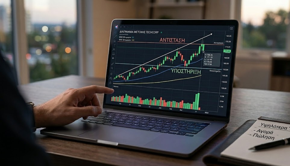
The foundation of most modern charts is the Japanese candlestick. Each candlestick represents a specific period of time, such as a single day. A green candle means the stock's price closed higher than it opened, indicating that buyers were in control. Conversely, a red candle means the price dropped, leaving sellers to win the day's battle. The thin lines protruding from the top and bottom of the candle's main body, known as wicks or shadows, show us the price extremes—the highest and lowest points—that the stock touched during that period.
The next step in chart reading is identifying the trend, as the market always moves in a specific direction. In an upward trend, the stock consistently creates higher lows and higher highs, demonstrating steady upward momentum. In a downward trend, we see the opposite: a sequence of lower highs and lower lows. Of course, there are also periods when the market moves sideways without a clear direction, trapped within a narrow price range, which usually foreshadows a sharp, sudden breakout to one side or the other.
Within these trends, a stock's price tends to react to certain psychological levels known as support and resistance. Support functions like the floor of a room. It is a price level where the stock is considered "cheap" or attractive, causing buyers to step in en masse, halting the decline and pushing the price back up. Resistance, on the other hand, acts like a ceiling. It is the point where the price is deemed expensive, sellers take their profits, and the upward move stalls. When the price manages to break through this ceiling with strong momentum, that resistance level often flips to become a new floor of support for the future.
To determine whether a price movement is genuine or a trap, we must look at trading volume, which usually appears as vertical bars at the bottom of the chart. Volume indicates how many shares changed hands. A price increase accompanied by high trading volume means that large institutional investors are backing the move, indicating a strong and healthy trend. Conversely, if the price climbs but volume is low, the move lacks real conviction and can easily reverse.
Finally, moving averages are the tools that help us filter out daily market noise and sharp fluctuations. These are lines that smooth out price action by calculating the average price over a specific timeframe, such as the last 200 days. When a stock's price stays consistently above its 200-day moving average, it is generally considered to be in a healthy, long-term uptrend, whereas trading below it serves as a warning sign of potential risk.
Reading charts is a skill that requires patience and practice. Start by observing the basics—the candlesticks, the trends, and the volume—and gradually you will begin to understand the unique story that every company's chart has to tell. Ultimately, technical analysis delivers its best results when combined with the study of a business’s financial results and its underlying fundamentals.

"Capital at Risk. Investing involves risk. The content of this site is for informational and educational purposes only and does not constitute investment advice."
Copyright © 2026 AevumX Capital | All rights reserved.